Monday, 13 December 2010
Lesson 1
In this beginning lesson, I set up my first blog and started to think about creating my own music magzine, I've also uploaded previous work from my student magazine as well as analyse different genres of music magazines and finally pick one genre to stick with for our music magazine.
Music Magazine Proposal
The genre of music that I am going to use for my magazine is rock. This is because rock is very popular amongst teens in today's society as well as adults who have fond memories of their childhood rock heroes e.g Black Sabbath, Rolling stones, Led Zepplein, Pink Floyd, Alice Cooper etc. As well as this, there are many different types of rocks from Glam Rock to Heavy Metal, which gives the reader alot more information and enjoy the different styles of rock, rather than stick to one rythym.
Rock is very popular in today's society, and is used in magzines like NME and Kerrang!, as well as on the radio, which means that rock is more or less open to anyone to hear or buy. Typically, in a rock magazine they offer tickets to concerts and dates wher different bands or solo artists might be playing, as well as different posters of your favourite rockstar.
The current price of NME is £2.30, and you can subscribe to NME for just £25.99 it is published once a week. Supposedly, NME has a target audience of teenagers as the main images used on the front cover wil appeal to them e.g The Pretty Reckless, Pete Doherty Etc. The reason why NME is called this is because it sounds like 'enemy' which suggests the magazine is rebellious and fierce which describes Rock in general.
My magazine is going to be called Fierce. I decided on this name as it's new, there is no other magazine called that and just the name itself straight away says what kind of genre it is.
I have narrowed down the masthead fonts which are very scruffy, bold and will capture the audiences attention and make them want to buy the magazine. also there is no other magazine which uses thes kind iof fonts. The three fonts include:
Segoe Print
Jokerman
Mattisse itc
Pop Music Magazine Front Cover

Classical Music Magazine Front Cover Analysis

Rock Music Magazine Front Cover Analysis

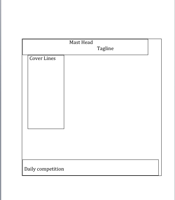
Student Magazine Outline
Student Magazine Front Cover

AS Media: Preliminary Exercise
My magazine is for a target audience of college students from ages 16 and up and is aimed at both genders. This is because in college, there is more equality in genders, compared to a primary school age where you would have to aim your magazine at a specific gender. This is because they’re more immature compared to college students and many primary students are not friendly with someone of an opposite gender.
The magazine contents would contain everything that a student would need, or want. This includes exam hints on how to get the best grade. Because many students are under pressure to get the best a-levels so they can get to university. Also, there would be an agony aunt to help teenagers with problems, ranging from exam pressure to anxiety about their appearance. I think that it is important to have this in the magazine, as teenagers are facing a lot of problems nowadays and have very low self-esteem, so if they are getting the help they may need, they will have a positive outlook in the future. As well as this, I think there should be a competition, where teenagers can get the chance to win prizes by using their common sense. This is a good idea as students will be learning and using their brain, as well as getting an appropriate prize that my target audience would want to win (which could be anything from concert tickets to £100).
The cover lines that I could be using for my magazine would include actual quotes from the articles, which will entice the reader and make them want to buy it. The quotes could include ‘I wish I studied more’ and ‘anybody can pass their exams’. This is a human-interest story as it will make the students read on to find out who said those quotes and why.
My magazine front cover will be called ‘Cram!’. This is because this is a slang word that teenagers use when they are describing that they are trying to remember some facts that they need to use for there exams. Also, the magazine will have puzzles and quizzes and lots of facts that the students may find interesting, and will ‘Cram’ it into their brains so that they will remember it for later on. I had other ideas, which included ‘Study’, and ‘Southdown’s weekly’ but I decided to reject these ideas, as they are very uncreative and too original. I wanted a name that will stand out and that no one else will think of it.
Font wise, I wanted a font that will relate to the type of magazine: Bold, serious and sophisticated, so far I have nailed it down to three types of fonts:
Apple Chancery
American Typewriter
Black Chancery
If I had to pick one of the three fonts, it would most likely be American Typewriter as it is much more bolder compared to the other three fonts and authors and journalists often use this type of font. Also the other two fonts suggest that it could be a girly magazine, and I want this magazine to be unisex. The Colour scheme of this magazine is Red and Dark Blue. I decided on these colours as they are both bold and will catch the eye of the reader, as well as appeal to both genders, as I want the magazine to be unisex.
I have decided on the idea of a tagline as in many films or magazines, they are always remembered because of a catchy tagline. My tagline would be ‘ For a better tomorrow’. This would be a good tagline as it suggests that this magazine will give you a positive future and you can achieve anything if you buy this magazine.
The year that my magazine will be published is summer time. This is because summer is a time to relax and when students party and have a good time, this magazine has a serious edge, however it is also fun, and I can show that buy having bright colours and happy faces, as everyone is happy at summer time as the work is finished and you can see your friends and do whatever you like. Also, as summer is a relaxing time this magazine will help people relax and unwind from all the pressures at college.
The Magazine will cost £1.15 and will be on a monthly basis. I decided on this, as £1.15 is the average cost of a magazine in society today, and having it on a monthly basis will be a smart move as many teenagers do not work an will not be able to afford £1.15 a week or every day which means that they will stop buying the magazine. By having it on a monthly basis means that the student can afford it and Cram! Magazine doesn’t lose business.
For the cover lines, I decided to have positive quotes from students about the magazine. This will make the reader want to buy it, before that have even read it, as they are more likely to listen to the opinion of other teenagers, compared to adults. Also by advertising competition prizes on the front cover, this will make the reader want to buy the magazine so they can win the prizes that most appeal to them.
Student Magazine Contents

This is my contents page from my student magazine 'Cram!'. it includes exam tips, interviews with celebrities and both the images and the colour's used will appeal to the chosen audience (students).
Subscribe to:
Comments (Atom)